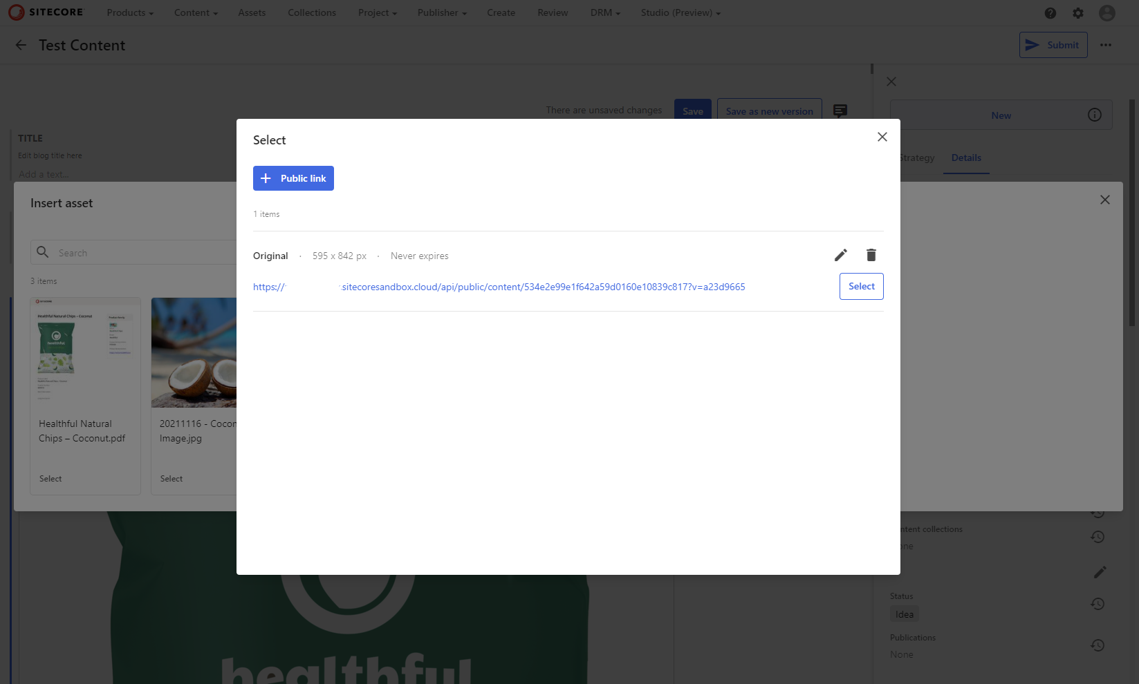
Selecting Public Links in Content Hub
One of Content Hub's most used features is it's ability to create public links for an asset, allowing unrestricted public access to a particular rendition - allowing them to be referenced in published content. When writing content using the CMP module there is a great UX that allows users to search for assets and select the exact public link to insert into content. A very similar flow is used by the DAM part of the Sitecore Connect for Content Hub connector. But what if we want to reference a public link outside of a rich text editor?

External Component
Not for the first time, external components are our friend here. The implementation of the selector used by CMP is actually really quite simple - it opens a Content Hub page, which, when a user selects a public link, posts a message back to the opening window with a payload which includes the selected public link's url. We can make use of this, by replicating that process - opening the url, and waiting for the selection message.
Below is the source for a react component, which can be placed on an entity details page to display a public link selector which uses this flow. Once the user selects the public link and the page posts the payload back, the component will then update the property on the entity.
import ReactDOM from "react-dom";
import React, { useState } from "react";
import { TextField, Button } from "@mui/material";
import LinkIcon from '@mui/icons-material/Link';

const SELECTION_URL = "/pages/en-US/SCDAMConnectApprovedAssets";

export default function createExternalRoot (container) {

    let isInitialised, linkUrl, entity, propertyName = false;
    const initialiseAsync = async context => {
        entity = await context.client.entities.getAsync(context.options.entityId);
        propertyName = context.config.propertyName;
        linkUrl = entity.getPropertyValue(propertyName);
        isInitialised = true;
    }

    const handleEntityChanged = evt => {
        if(entity.id === evt.detail.id && evt.detail.memberName == propertyName)
            linkUrl = evt.detail.value;
    };
    window.addEventListener("ENTITY_CHANGED", handleEntityChanged);

    return {
        async render(context) {
            if(context.entity == null)
                return;
            if(!isInitialised)
                await initialiseAsync(context);

            const handleUpdate = async link => {
                context.entity.setPropertyValue(propertyName, link); // this is needed to trigger the ENTITY_CHANGED event
                entity.setPropertyValue(propertyName, link);
                await context.client.entities.saveAsync(entity)
            }

            ReactDOM.render(
                <PublicLinkField
                    linkUrl={linkUrl}
                    label={context.config.propertyLabel}
                    theme={context.theme}
                    onUpdate={handleUpdate}
                />,
                container
            );
        },
        unmount() {
            ReactDOM.unmountComponentAtNode(container);
        }
    }
}


function PublicLinkField({ linkUrl, theme, label, onUpdate })
{
    const [value, setValue] = useState(linkUrl)

    const handleSelect = link => {
        setValue(link);
        onUpdate(link);
    }

    const handleChange = evt => {
        setValue(evt.target.value);
    }

    const handleBlur = evt => {
        onUpdate(evt.target.value);
    }

    return (
        <div style={{display: "flex", gap: "1rem" }}>
            <TextField
                label={label}
                theme={theme}
                value={value}
                onChange={handleChange}
                onBlur={handleBlur}
                fullWidth
                size="small"
            />
            <PublicLinkSelector onSelect={handleSelect} />
        </div>
    )
}

function PublicLinkSelector({ onSelect })
{
    const [selectorPopup, setSelectorPopup] = useState(null);
    const handleClick = () => {
        const selectorPopup = window.open(SELECTION_URL);
        setSelectorPopup(selectorPopup);
    };

    window.addEventListener("message", event => {
        if(event.source !== selectorPopup || event.origin !== window.location.origin) return;
        selectorPopup.close();
        onSelect(event.data.public_link);
    });

    return (
        <Button
            variant="outlined"
            disableElevation
            onClick={handleClick}
            startIcon={<LinkIcon />}
            style={{flex: "none"}}
        >
            Select Public Link
        </Button>
    )
}
The configuration for the component takes two properties:
propertyName: The name of the property on the entity to usepropertyLabel: The label to use on the UI for the field.
{
    "propertyName": "PublicLinkUrl",
    "propertyLabel": "Public Link",
}
Below is a video showing the component in action. The page has an entity details component at the top of the page, used here to show that the external component is updating the entity, with the external component below:
#GoForIt
Although it won't fit every use case, the public link selector component above is a handy way to leverage Content Hub's public link feature in any context. By using this external component, we can easily make use of the existing UI from the DAM connector in our own custom pages, also allowing us to provide a consistent and user-friendly experience for selecting public links across different areas.
If you happen to use this component in a project, I'd love to hear about it, drop me a message!