Using External Components in Content Hub 4.2
Content Hub version 4.2 was released in early 2022 and naturally brought a range of improvements (Release Notes). The most significant, in my view, was a switch from Knockout, in favour of React for (most of) Content Hub's internal rendering and, importantly for us, External Components.
Hello World!
To ease development of new 4.2 external components, I created a Content Hub External Components Starter Template which has everything you need to get creating components quickly. Let's run through how to create a classic Hello World component using the starter template:
-
After cloning the repo from GitHub, run npm i to install the required node packages
-
Create a new directory within src called “HelloWorld”
-
Inside this directory, create a file called “index.jsx”, and set its contents to the following:
hello-world.jsximport ReactDOM from "react-dom"; import React from "react"; export default function createExternalRoot (container) { return { render() { ReactDOM.render( <div>Hello World</div>, container ); }, unmount() { ReactDOM.unmountComponentAtNode(container); } } } -
Now, so that webpack knows about our new component, add the following to the entry array within webpack.config.js
HelloWorld: './src/HelloWorld/Index.jsx', -
Run
npm run buildornpm run watchto build the components. This should create a directory called public. -
Run
npm startto start the web server. You should now be able to see your compiled .js file at http://localhost:3000/HelloWorld.js
Now that the component is written and hosted locally, it can be added to a page in Content Hub.
Top Tip: It took me an embarrassingly long time to realise this, so hopefully this helps you - because external components are loaded on the client side, you can host you component locally whilst in development and still have it run in a public instance of Content Hub.
Simply add a new external component to a page and set the resource url to http://localhost:3000/HelloWorld.js. Now when the page is loaded, there should a lovely Hello World statement 😀.
Component Examples
Now that we know how to develop and deploy an external component in Content Hub, let's look at some use cases based on real-life examples.
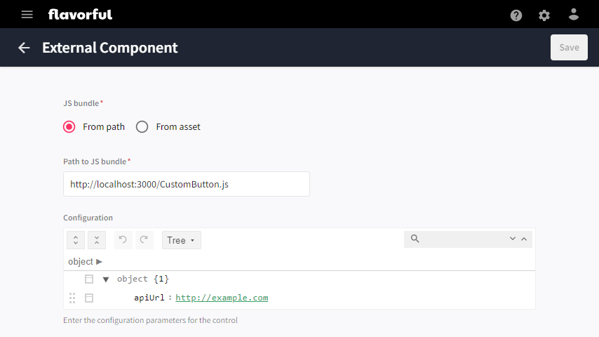
Custom Button
A customer had a requirement for a button on a page, that when clicked called an api endpoint to perform an action. This can be easily achieved with the following code (note that it has been simplified for ease of reading):
import ReactDOM from "react-dom";
import React from "react";
import Button from '@mui/material/Button';
import { RealtimeRequestByUsername } from "@sitecore/sc-contenthub-webclient-sdk/dist/models/notifications/realtime-request-by-username";

export default function createExternalRoot (container) {
    const clickHandler = async (url, client) => {
        // call the url
        const request = new RealtimeRequestByUsername();
        request.recipients.push("nvn@sitecore.net");
        request.setBody(`Endpoint ${url} successfully called`);
        await client.notifications.sendRealTimeNotificationAsync(request);
    }

    return {
        render(context) {
            if(!context.config.apiUrl)
                return;

            ReactDOM.render(
                <Button
                    variant="contained"
                    disableElevation
                    theme={context.theme}
                    onClick={() => clickHandler(context.config.apiUrl, context.client)}
                >
                    Custom Button
                </Button>,
                container
            );
        },
        unmount() {
            ReactDOM.unmountComponentAtNode(container);
        }
    }
}
There are two interesting concepts that have been applied here.
First is the context object that is passed to the render function. The config property, a JSON object that has the value of the configuration set in the external component, is being used to supply the url of the api endpoint to call. The context object also has a property called client which is a pre-authenticated Content Hub Javascript SDK client, and this is being used to supply a real-time notification to the user.
Second is the use of a Button component from the fantastic @material/mui library (this is included as a dependency in the starter template). This is interesting because, it's the same library that Content Hub uses internally, meaning we can produce components that match the look and feel of the rest of the application. Additionally, by setting the theme property, via the context object, the component will even match the particular theme that the current user has set.
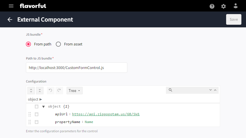
Custom Form Control
This example is based on a requirement that a customer had for a dropdown menu to allow users to select the name of a member on an object. Here I'll simplify this to showing how to integrate a custom form control component. I am going to use the following free API endpoint - http://api.zippopotam.us/GB/SW1 - which returns locations within a postcode area (in this case, SW1), to populate the dropdown menu. The simplified code is as follows:
import ReactDOM from "react-dom";
import React, { useState, useEffect } from "react";
import { MenuItem, TextField } from "@mui/material";

export default function createExternalRoot (container) {
    return {
        async render(context) {
            if(context?.options?.entityId == null || context?.config?.apiUrl == null)
                return;

            const entity = await context.client.entities.getAsync(context.options.entityId);

            const handleSelect = async value => {
                context.entity.setPropertyValue(context.config.propertyName, value);
                entity.setPropertyValue(context.config.propertyName, value);
                await context.client.entities.saveAsync(entity);
            };

            ReactDOM.render(
                <CustomFormControl
                    apiUrl={context.config.apiUrl}
                    label={context.config.propertyName}
                    theme={context.theme}
                    value={entity.getPropertyValue(context.config.propertyName)}
                    onSelect={handleSelect} />,
                container
            );
        },
        unmount() {
            ReactDOM.unmountComponentAtNode(container);
        }
    }
}

function CustomFormControl({ apiUrl, label, theme, value, onSelect })
{
    const [options, setOptions] = useState([]);
    useEffect(() => {
        async function getOptions() {
            const response = await fetch(apiUrl);
            if(response.ok)
            {
                const responseJson = await response.json();
                const options = responseJson.places.map(p => p['place name']);
                setOptions(options);
            }
        }
        if(!options.length)
            getOptions();
    }, [])

    const handleChange = event => {
        if(onSelect)
            onSelect(event.target.value);
    };

    return (
        <TextField
            select
            defaultValue={value}
            onChange={handleChange}
            label={label}
            theme={theme}
        >
            {options.map(option => (
                <MenuItem value={option}>{option}</MenuItem>
            ))}
        </TextField>
    )
}
This component again adds two interesting concepts. The first, is that of using the fetch api to retrieve data from an api endpoint - whilst this may seem trivial, it is worth mentioning because of the infinite possibilities that it opens for bringing data into a Content Hub component or page.
The second concept is probably the more interesting one, which is that of using the Javascript SDK to retrive and save entities. In this case we are only modifing one property, but there is no reason a component could not change many properties, or even many entities!
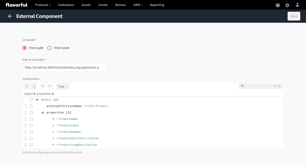
Entity Details Language Viewer
This last example is again based on a real customer requirement, for the sake of simplicity I have removed some code related to styling, but other than that it's the same. The client wanted a user to be able to easily enter translations for a product - being able to see the en-US version alongside the field that a translation could be entered. Sounds like a job for external components right?
import ReactDOM from "react-dom";
import React from "react";
import { MenuItem, TextField } from "@mui/material";

export default function createExternalRoot (container) {
    return {
        render(context) {
            if(context.entity == null)
                return;

            ReactDOM.render(
                <EntityDetailsLanguageViewer
                    client={context.client}
                    config={context.config}
                    culture={context.options.culture}
                    entity={context.entity}
                    theme={context.theme} />,
                container
            );
        },
        unmount() {
            ReactDOM.unmountComponentAtNode(container);
        }
    }
}

function EntityDetailsLanguageViewer({ client, config, culture, entity, theme })
{
    const [language, setLanguage] = React.useState(culture);

    return (
        <div>
            <LanguageSelector client={client} language={language} theme={theme} onLanguageSelect={setLanguage} />
            <EntityViewer client={client} config={config} entity={entity} language={language} />
        </div>
    )
}

function LanguageSelector({ client, language, theme, onLanguageSelect })
{
    const [languages, setLanguages] = React.useState([]);
    React.useEffect(() => {
        async function getLanguages() {
            const cultures = await client.cultures.getAllCulturesAsync();
            setLanguages(cultures);
        }
        if(!languages.length)
            getLanguages();
    }, [])

    const handleChange = event => {
        onLanguageSelect(event.target.value);
    };

    return (
        <TextField
            select
            value={language}
            size="small"
            theme={theme}
            onChange={handleChange}
        >
            {languages.map(language => (
                <MenuItem value={language}>{language}</MenuItem>
            ))}
        </TextField>

    )
}

function EntityViewer({ client, config, entity, language })
{
    const getPropertyLabel = (label, language) =>
    {
        return label[language] ?? (Object.values(label)[0] ?? "");
    }

    const getPropertyValue = (entity, propertyName, isMultiLanguage, language) =>
    {
        return entity.properties[propertyName][isMultiLanguage ? language : "Invariant"] ?? "-";
    }

    if(!language.length)
        return;

    const [propertyConfigurations, setPropertyConfigurations] = React.useState([]);
    React.useEffect(() => {
        async function getPropertyConfigurations() {
            const entityDefinition = await client.entityDefinitions.getAsync(config.entityDefinitionName);
            const propertyConfigs = entityDefinition.memberGroups
                .flatMap(mg => mg.memberDefinitions)
                .filter(m => config.properties.includes(m.name))
                .map(m => ({ name: m.name, labels: m.labels, multiLanguage: m.isMultiLanguage }));
            setPropertyConfigurations(propertyConfigs);
        }
        if(!propertyConfigurations.length)
            getPropertyConfigurations();
    });

    return (
        <div>
            {propertyConfigurations.map(propertyConfiguration => (
                <dl>
                    <dt>{getPropertyLabel(propertyConfiguration.labels, language)}</dt>
                    <dd>{getPropertyValue(entity, propertyConfiguration.name, propertyConfiguration.multiLanguage, language)}</dd>
                </dl>
            ))}
        </div>
    )
}
The video demonstration shows the component in use. The Entity Details Language Viewer is on the left side of the page and allows the user to view the values of the product in any language, separate from the entity details panel on the right, used for entering the translations.
One really interesting aspect of this for me, is that it is easy to see that by replacing the entity details component on the right with a new external component that uses an api to modify data (much like the Custom Form Control above) this page could be extended to provide auto translations, via an external service such as the Google Translation API.
Final Thoughts

This post has taken a slight departure from my usual light-hearted tone (there wasn't even one meme in the whole post!), but I'm sure usual service will be resumed shortly.
Before we say our goodbyes though I'd like to summarise that the takeaway here really is that external components in Content Hub 4.2 are really quite exciting and pretty powerful when put to good use. I also really hope that the starter template I created can be of some use - I know it's not perfect, and I am fully open to suggestions and PRs. I look forward to seeing them!